Wednesday, 19 March 2014

4.How did you use media technologies in the construction and research, planning and evaluation stage?


Using media technologies has definitely played a part in the stages of creating our product and in my opinion I feel we have used them very effectively through each individual stage.

 Research and planning

 When researching, the Internet become very useful as it gave us access to a number of very key websites such as YouTube. By using YouTube we had the chance to research into existing bands of the same genre to see what their videos were like and most importantly to see what we could use in our video to make it as professional as existing products. We also used Google very effectively as it allowed us to research into firstly the theories of music videos such as ‘Goodwin’s theory’ but also allowed us to research more into the codes and conventions of an indie rock band and to see what their certain styles were like and how we could portray them effectively.

 
Furthermore a lot of research consisted of me getting feedback from our target demographic this was to make sure that what we was working towards appealed to the right audience that would actually enjoy the music video.  Using social networking sites such as Twitter and Facebook was very useful as it allowed us to post drafts of our work for audiences to comment on and most importantly to see if they like our progress, this helped us because we would always take feedback onboard and apply it to our product to make it as best as possible.


The Internet was also very helpful when making our ancillary products as there was numerous Digipak examples out there for us to look at and to get a clearer understanding of what a Digipak was and how they worked and more importantly how each artists made their Digipaks specifically for a certain genre of music.  Having the access to online adverts and posters of music artists also contributed to the research that I undertook and influenced my planning as it gave me a clear understanding of how artists are promoted through different media structures.


Planning in advance definitely helped us in the long run because through the online website ‘blogger’ we had the chance to document any progress that was made which helped keep my work organized. It was extra useful when planning for film shoots as we could plan different shoots but also document them by explaining about each shoot and saying how it went.


 Production and construction:

 During the production of our music video, we filmed all footage on a DSLR 500, which is a very high quality camera that enabled us to experiment a lot more complex shots purely because we knew what this piece of equipment was capable of. This now made our music video a lot more professional and looks to a high quality standard. We also established that using the iOS toll on the camera allowed us to ensure that we are filming with the most amount of light available to guarantee that our music video is lighted correctly when being viewed.

 
When constructing the final piece software’s such as Final Cut Pro become very useful because this is were the whole editing process takes place and that is how all of the certain clips are merged together. This enabled us to upload the footage and put it together and use certain tools to cut clips to edit the pace and to also add the soundtrack to match up the clips so that continuity was recognised.


From using media technologies in our research when producing the animatic and researching other bands existing products, we knew we had to make our video fast paced by using quick cuts and Final cut enabled us to do this.  We also needed to show our character growing up therefore we used the fade tool so that the youngest character would fade out and the eldest would fade in. We wanted to get the message across quickly and simply that the boy is growing up in age therefore the cross fade enabled us to merge both video clips together to give that effect. Final cut also allowed us to put alter the colour scheme for the music video and put the clips into black and white which was a technique which we had in mind from the very start because due to research into existing music videos in this genre they use black and white to fit with the indie tone.


Overall media technologies were very vital throughout the whole process of research and planning and also production and construction. By having access to all different types of technologies I have had the chance to push limits and produce better standards of work due to technologies being at such a high standard.
3. Audience Feedback


2.How effective is the combination of your main product and ancillary texts?


When it came to merging all three media products together which is the music video, poster and digipak, I decided that I wanted them all to link in with each other therefore I decided to feature a black and white colour scheme throughout so that the idea of consistency was recognized. I have also decided to use the same font throughout my two ancillary texts which was ‘Copperplate’ I felt it was important to use the same fonts so that again the similarity was recognized between the two products and that overall they did look remotely similar due to the colour scheme and also the fonts used.


The whole idea behind the concept of my digipak came mostly through a lot of research into existing bands and how they portrayed themselves through their certain albums/digipaks and posters. Very similarly they did use different colour schemes such as black and white which showed how they have reflected their genre correctly. Therefore I felt it was essential to follow this trait to make my ancillary products look as professional as possible. Throughout my Digipak and poster I decided to use lots of photos of us as the band as I felt that as we are a newly established band it was important that our image was shown repeatedly to the audience so that they got an understanding of us as band members. The photos I used show us in locations such as London I felt that as the band are from London it was important to show their background as they are proud of their roots.


Also with my two ancillary products I made sure that I featured the bands website and also social media links as in this day and age the bands fans will like to follow the band through the internet on websites such as twitter. Lastly again due to research I decided to put the bands record label on both of my products as this will give the audience an understanding of what type of music we produce.


When linking the ancillary products to the main product the combination is quite successful in my opinion, they are rather similar mainly due to the on-going theme of black and white which I have mentioned previously. This theme has been a key trait throughout the products and has definitely proved to be more than effective in the music video. The use of the black and white gives the video quite an edgy feel and fits very well with some of the shots which we have decided to use especially during the fight scene as the colour really emphasizes the darkness of the fight scene.


Again the link between the ancillary products and the main piece is effective because the genre has really been established very well throughout both pieces of work for example in the music video we used lots of band performance which was very popular in existing indie/rock genre music videos. The link to genre is that on my digipak I included a photo of the band in the studio which represents the bands image and also the genre in this photo the band are shown to be on their own instruments which again shows that producing music is very important to them and they want to give the fans an idea of what it looks like. This again was similar to existing products as a lot of indie rock bands care more about the making music side of the band than promoting their image, as this is something that you would link more with pop artists.

1.In what ways does your media product use, develop or challenge forms and conventions of real media products?


During the early process of making the music video we were given different briefs on different artists to whom we had to develop and produce a music video for. As a group we decided that we wanted to create our own brief and that we wanted to represent an ‘Indie rock band’. The next step we had to take was choosing the song we decided on Kasabians – Club Foot as we all had some pretty good ideas relating to this song when listening to the lyrics.  We then decided on the band name ‘Rogues Gallery’ as it has a very indie feel to it.
 

We had to consider what the codes and conventions of our genre would be which is ‘Indie Rock’. To do this and to make our interpretations a lot easier we carried out a lot of research by looking on the Internet and also looking into similar bands to us such as Kings of Leon, Oasis and Kasabian. When looking in to these previous bands each of them all had something which made them different which we all really liked therefore we felt that we wanted to combine these strengths by adding them to our band image and performance to make it as successful as possible.


When looking into what codes and conventions we used we firstly related it all to Andrew Goodwin’s Theory and thought that if we could use as many as these conventions as possible then we will have a successful overall product. The codes and conventions that Goodwin thought out are:


  • A relationship between the lyrics and the visuals, with the visuals illustrating, amplifying or contradicting the lyrics.
  • A relationship between the music and the visuals, with the visuals illustrating, amplifying or contradicting the music.
  • Genre-related style and iconography present.
  • Multiple close-ups of the main artist or vocalist.
  • Voyeurism often plays a major part, especially in relation to females.
  • Intertextual references to other media texts may be present.


Relating to the music video our relationship between lyrics and visuals shows our youngest actor Freddie on a training scene the lyrics sang at this point are ‘chase down an empty street’ therefore we felt that we should portray this by showing him running down an empty street so that the lyrics and visuals link in and that this convention is clearly recognized by the audiences who watch the video.


We have also made a clear representation of the relationship between the music and the visuals this is seen by us matching the pace of the music whilst editing so that it is in sync with the visuals, we have also featured a guitar solo of myself which shows me performing along with the beat of song, throughout the video we have clips cutting back to Harry the lead singer who is shown singing the song this again shows that we have followed this convention correctly as Harry is singing in time with the song so it looks like a professional performance.


When following the next convention, which is showing how we have portrayed the genre, it showed that our research had paid off, as we all knew what had to be featured to show the best image of an indie rock band. As a group we decided to make our style and image very important therefore we had to make sure that we was all dressed very appropriately we decided that black jeans, shirts, jackets and desert boots and brogues were the correct style as when looking at the existing bands this was they what they were all wearing. Again from our research we found that a vast majority of bands do feature a narrative but also a band performance to show each band member performing with their certain instrument therefore throughout we decided to cut back to the band and show us performing.


Throughout our video we again followed another of Goodwin’s theories by including lots of close ups throughout which were mainly of our lead singer Harry. The close ups are mainly there to reflect the expressions shown on his face to capture certain images from different angles. When filming the band we did try to capture close ups of each member as we are the selling point and as we are a newly established band it was important to get our image across to the audience and for us to be recognised. When also filming our narrative side to the music video we used close ups again to capture the emotions shown on our characters faces but also to show their importance. When filming our footage one of the characters had a scar that we wanted to be very identifiable therefore a close up shot was shown so that it was easily recognizable for the audience.


In our music video Notion of looking is used through viewing something from a different point of view therefore in this case we are referring to the CCTV footage which we have which is used to try and show the fight scene from a different perspective. The shot used is very clever as it really does show a perfect angle of the fight scene along with the cuts used to show it from a normal angle the contrast between the two makes the scene look a lot more professional and realistic.


Lastly the final convention that we followed was ‘intertextual referencing’ as a group we all liked this idea as it gave us the chance to reference a part from an existing media product. When initially planning we had a few good referencing ideas however the one that we leaned towards was the very famous running scene from Rocky III. This idea worked very well with our video as we needed to feature a training scene therefore we decided that by us using this it works very well and the referencing is very easily recognizable due to a very similar location and also a good use of similar shots which will also help the audience understand the reference.


Overall throughout the music video we have followed every convention very accurately which shows that we have stuck to the correct structure of a typical music video. We haven’t actually challenged any of the conventions or gone against them which shows that we didn’t want to change or adapt any of the existing conventions.


Thursday, 6 March 2014

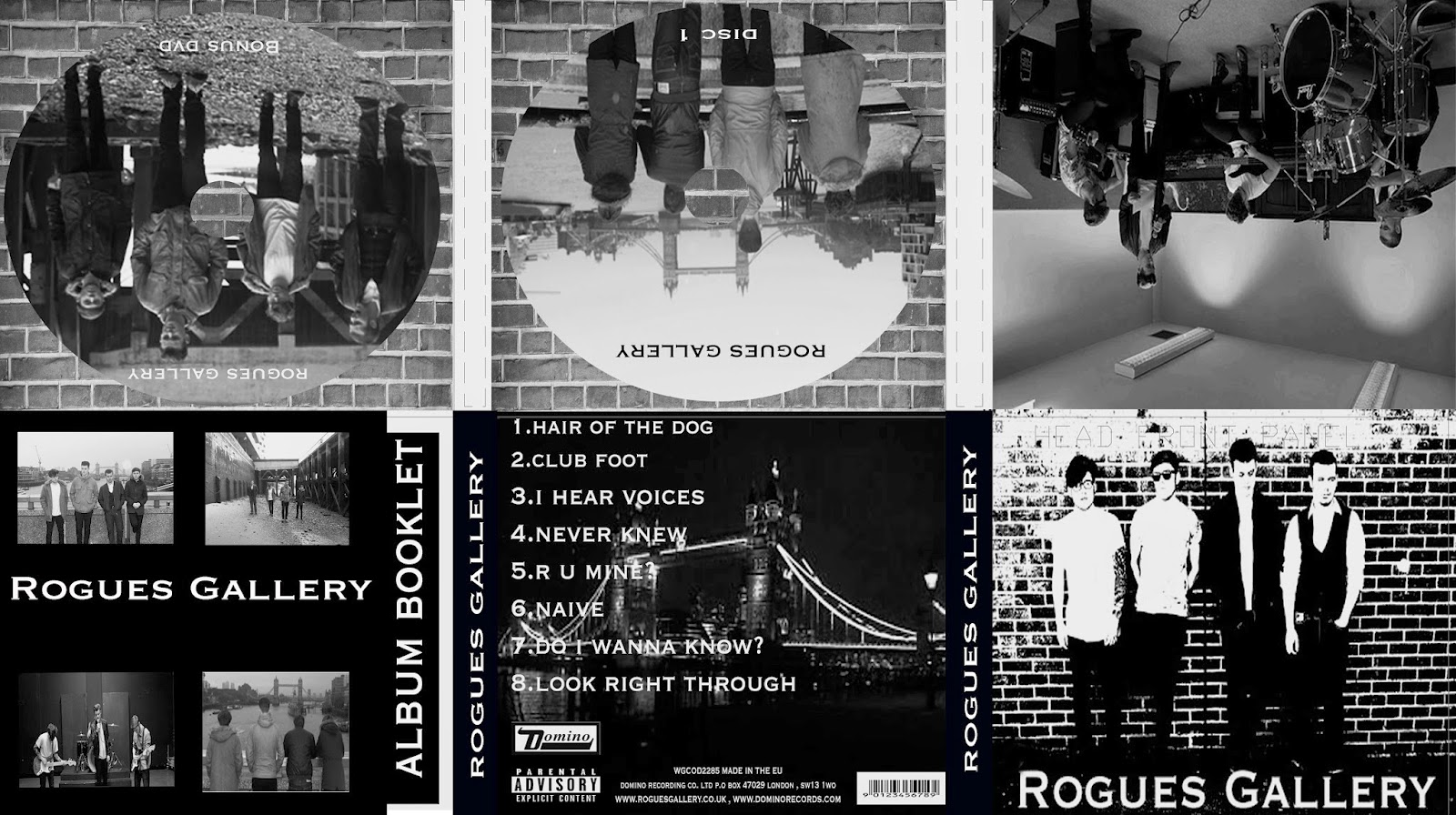
Digipak - Final Piece


This is my final digipak after a lot of editing and changes. I have now changed around each panel and laid them out into the correct format so that when folded into the digipak format it will all look correct. I have decided to keep the same images from my 1st draft and the only changes which I did change was bringing up the contrast on each of the photos so the idea of continuity was recognised.

Overall I am pleased with my end product as it does reflect an indie rock band very effectively. The colour scheme works very will with the images and also the use of a photo of the band performing shows that producing their music is important to them which is a similar trait throughout indie albums

Thursday, 27 February 2014

Digipak Poster - Final Piece


Here is my final version of my poster for my digipak. Since we received our feedback from the class I was asked to try and not leave as many gaps as there was still quite a lot of room that could still be used. Therefore I decided to make all the fonts a bit bigger so that it was more condensed this was also a benefit for me as the words on the posters will now be bigger and more easier for the audience to read.

I have also decided to make the band name 'Rogues Gallery' stand out more by using two white lines above and below the font this way it attracts the eye of the audience. I have also replaced the white box which the font was in with a black one the font will now stand out more as the whole poster has a continuous theme with black background and either white or red coloured font.

The last alteration that I made was adding a social networking icon with our twitter name I decided to do this as when I was researching recently many current music artists like to socialise with their fans through the many social networking sites which are around today therefore I thought that I would follow this common theme. I have had to move the Domino logo in order to put this in therefore I have placed it just above our website on the left hand side.

Overall I am pleased with this current piece and I am pleased that the feedback which I received has benefitted me and my work. I am now feel that the piece I have created looks a lot better after a few alterations had been made. I still may decide to add a few other features at a later date however at the moment I am pleased with this poster.